Welcome Friends!
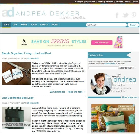
I’m pleased as punch to be the very first to welcome you to the NEW AndreaDekker.com!
It was a long weekend, but we made it… and almost everything is squared away (still a few kinks to work out — but that’s to be expected, I suppose.)
I’m just loving my new name and logo!!!
Especially the little “ad” icon.
You might notice that aside from the header and a few new additions to the sidebar, things really don’t LOOK a lot different — and you’re right.
I’ve made most of the visible changes slowly over the last 4-6 weeks, so this weekend was mostly behind-the-scene stuff (and that’s the scary stuff because it’s so easy for something tiny to cause huge issues!)
I originally wanted to do a fun “movie post” with pictures, music, video clips, etc. I had everything planned out, the pictures selected, my “script” written, and even my choice of song for background music.
I worked my butt off to get all my other blog posts, housework, virtual assistant work, guest posts, and other tasks completed well ahead of schedule so I could spend Wednesday – Saturday “making the switch”, tying up loose ends, and creating my video. I even went to a special training at the Apple store to learn some cool video-editing tips.
Then REAL LIFE happend…
The babysitter and her whole family came down with the flu, the back-up babysitter was unavailable, Nora got sick, playgroups were canceled, naps were refused, and sleeping at night… well, it basically didn’t happen (because of Nora, not because I was working on the blog.)
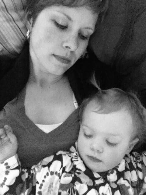
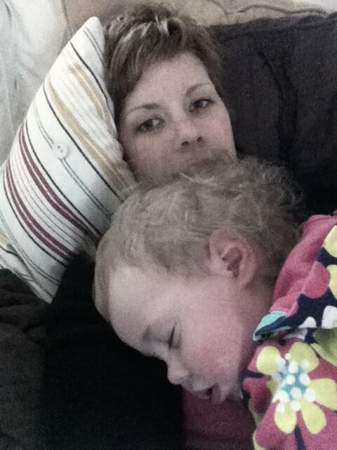
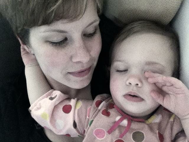
So, I ended up spending the majority of Wednesday – Friday like this.
I couldn’t even get a break from the weather (it was freezing cold and raining all week long). Getting fresh air or going for walks was out of the the question (especially with Nora’s cold). Even long car rides didn’t put Nora to sleep — which is extremely rare.
Nora needed to sleep and nothing worked. So there we sat on the couch — the only way she would sleep.
At first I was flustered, and upset — why NOW, of all times!
Then I reminded myself that the whole point of AndreaDekker.com is to share tips, ideas, recipes, and solutions to simplify REAL LIFE for real families, with real homes, real budgets, real schedules, and real lives. Not to produce cool videos that might “wow” a few readers.
So here I am, sharing MY real life with you.
No cool videos today (but Nora is feeling much better!)
Thanks to Dave’s help over the weekend, I was able to accomplish everything that absolutely HAD to be finished by Saturday night… and I never even worked past 11:30pm!
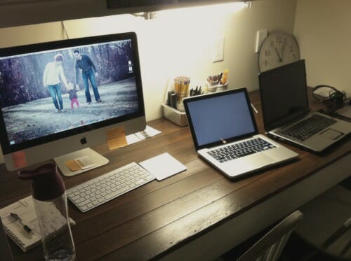
This is what my desk looked like most of the weekend — notice that it’s only 11:05 and I’m already starting to close up for the night 🙂
Real life at the Dekker’s, my friends!!
So what exactly did I change?
There are a TON of behind-the-scene web changes, as well as lots and lots of business, financial, and legal information I had to update — but you’ll most likely never notice any of that stuff. It’s all important… and a HUGE pain, but at least it’s all finished now!
The overall style and design of the blog did not change much — and of course, the content will remain the same. However, what you might notice are a handful of visible changes that will hopefully improve this blog and make it easier for you to navigate and find the information you need.
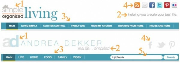
Most of the visible changes are located in the blog header — you can see both the before and after headers below (click on the image to enlarge it)… and read more about each change via the corresponding numbered points below.
1. Simplified Name, Logo, and URL
So this is a biggie! You can read more about my decision to completely change my blog and business name here and here.
Personally, I like using my name, I like that it’s a shorter URL, I like that it’s easy to remember, and I like the 2-color logo instead of the busier 4-color logo.
2. Simplified Tagline
I absolutely love the feeling I get every time I say (or think) “real life… simplified”. It sums up everything I want to portray for my blog and my business in just 3 words.
It’s perfect 🙂
3. Simplified Categories
I really wanted to simplify all my category names to single words — and I love the new LIFE, HOME, FOOD, FAMILY, and WORK tags.
As you’ll notice if you browse through the categories a bit more, I’ve eliminated the CLUTTER CONTROL tag and have incorporated it under the “Organizing” sub category for HOME. Although clutter control is still a huge part of what I do, I feel that it just fits better as a subcategory now than as it’s own main category.
I like the look of the single words, and I also like having just 5 main categories instead of 6 — especially since I’m currently only blogging 5 days a week now.
4. Simplified Social Media
I’m finding that I really only have time to devote to a few social media platforms — Facebook being the main one right now. I use Twitter and Pinterest sparingly and have decided not to invest my time or energy into any of the many, MANY other options!
So, I made those 3 icons very visible and got rid of the cluttered look of everything else.
5. Simplified Search
I wanted to make it really easy for you to find whatever you’re looking for, so the search bar is now RIGHT in the navigation bar. Can’t get much simpler than that!
I cleaned up the side bar a bit, added some fun new images of my smiling face, updated my contact information and my virtual recipe box, added way more information than you care to know on my about page, and basically just tried to give everything a fresh, clean, simple look.
If you’re reading this in your feed reader or in an email, PLEASE click through to this post and check out the live site 🙂
So… what do you think?
I have a fun line-up of posts for the rest of the week — including some fabulous giveaways tomorrow — so make sure you come back 😉
Also, if you see something that’s not working right, or if you experience any issues, feel free to contact me. It might just be a glitch that we already know about, but it’s helpful for me to know where problems are (and I won’t think you’re complaining!)
Moving Forward as AndreaDekker.com:
I think the following section from my About page pretty much sums it up.
My house, my family, and my life are far from perfect, but that’s OK — I’ll share them with you anyway.
It’s all here and more.
My hope is that AndreaDekker.com will be a resource to motivate, encourage, and inspire YOU to make positive changes in your home, your family, and your life. So grab a comfy chair and a cup of coffee… I’d love to have you stick around for a while!



Holi Photos says
It celebrates the arrival of monsoon after a season of oppressive heat.
When you have vented, they may offer feedback or have a suggestion, but they also acknowledge that you have to follow what is in your heart.
The Hindi festival, Holi, a springtime festival of colors in India inspired the Run or
Dye event.
Shantae says
WOW just what I was searching for. Came here by searching for voyance gratuite
Molly says
Andrea,
It looks great, keep up the good work
I am excited to see what is up and coming
Molly
Kellie says
Congratulations Andrea! I have been a loyal follower for over 2 years and it has been so exciting to see the amazing changes your family and business have gone through! I am so excited to see what’s in store!
Amanda says
I LOVE the new website!!! I am not one for change very often, so when someone does a major change, like you have it makes me want to make a big change… I am ready to tackle my JUNK room!!!!
Olga says
I love the new site, Andrea! It matches you so well – simple, elegant and organized.
Congratulations! I’m sure it must be a relief to have it up and running – it must have been so much dedication and hard work.
Sara says
It looks GREAT! Give yourself a pat on the back!
Mary says
Looks great, but using Mozilla Firefox, your new logo, name and tagline don’t show up for me. Just thought you’d want to know.
Andrea says
Thanks Mary — I’m guessing you have to clear your browser cache and cookies — then refresh your page and it should show up!
Luba says
What a great new look, Andrea! You did a wonderful job, and I look forward to following your blog.
Sarah says
Congratulations! I do think your new design is much simpler, not that the old was complicated, but still. It’s so nice and airy 🙂