Ok friends, I’m branching out on a limb here and changing up my content a bit. But don’t worry, it’s just this ONE post…for now!
I wasn’t even sure what category to file this post under, so I opted for “Clutter Control” because I think social media and website stats can be “cluttery” and confusing issues for lots of bloggers — including myself.
But I’m trying to simplify the process… I promise!
My Experiment:
Lately, I’ve been experimenting with different ways to increase traffic to my website. All of my ideas have been completely free and thankfully, many of them have worked quite well.
However, one of my ideas in particular was a HUGE success!
Since I implemented this idea a week ago, my facebook “likes” have grown by 30% and my blog traffic has skyrocketed!

Want to know what I’m doing?
I simply created a Facebook photo album and shared a few of my favorite pictures with links back to the corresponding blog posts.
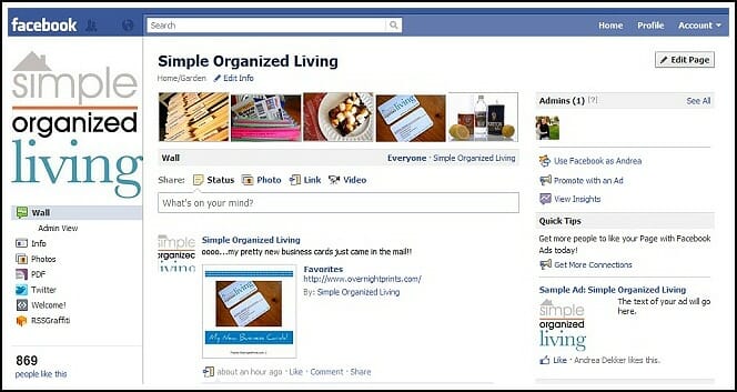
Once my photos are added, they automatically show up in the slide-show across the top of my Facebook Page. {This feature is only on the new Facebook pages — if you haven’t updated yours, you should do so!}
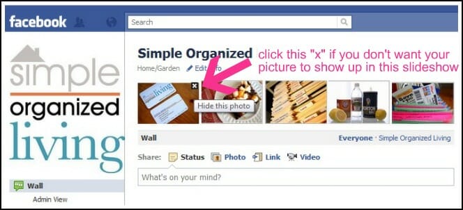
IMPORTANT –>>Then I make sure these images are the ONLY images that show up in the slide show.
If you have other images that don’t specifically link back to your website, simply click the “x” in the top right corner and they will be removed from the slideshow. {They will still be available via your “photos” tab though}
This way, when any of my Facebook followers click on those images, they will be able to click through to my website to read all about my organizing tips, favorite recipes, decorating ideas, etc.
You can see all the images I created here.
Or just scroll through some of them below.
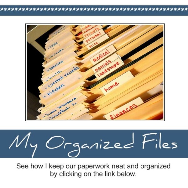
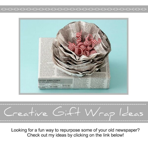
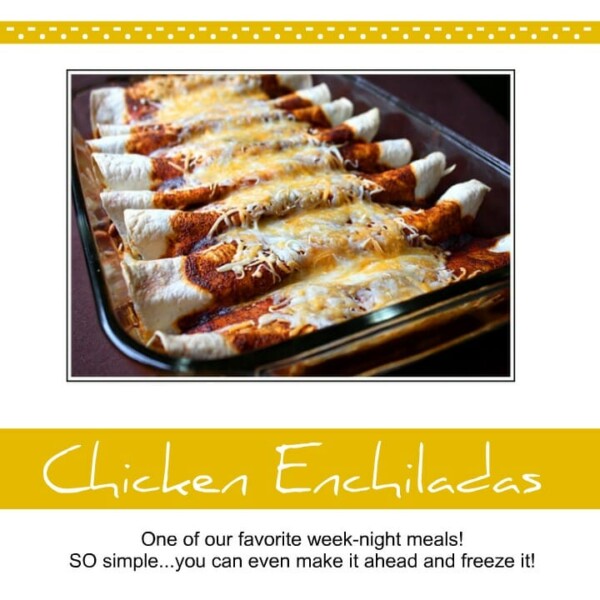
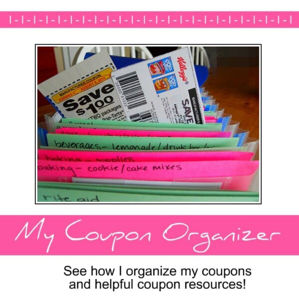
How To Create These Images.:
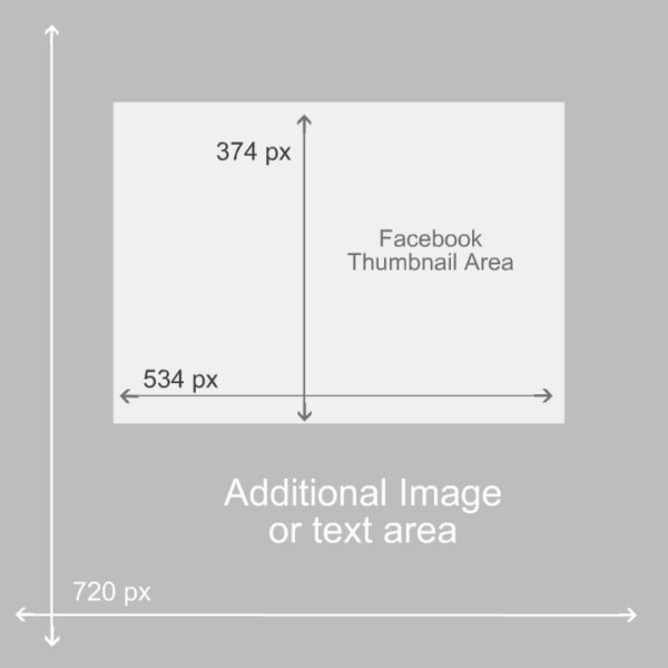
I used Picnik to resize, edit, and add the fun boarders and text. But I also use this “style guide” to make sure all my images look the same, and to make sure the thumbnail image shows up correctly in the Facebook slide show.
For Example….
Your images should all be sized 534 x 374px because that’s the area that will show up as a thumbnail on Facebook. The image should be centered and closer to the top than the bottom.
The rest of the 720x720px area can be an “advertisement” for your blog post or a place to add additional photos.
Then, once you upload your photo, leave the link to that blog post in the “comment” section. Now, anyone who takes the time to scroll through your Facebook photos will be able to click through to your website!
If you’re still confused, just click over to see how I have it set up.
An added bonus:
Your Facebook page looks great because you have fun new pictures for your readers to look at!
.
This simple Facebook update has worked WONDERFULLY for my blog traffic… and hopefully it will give you a few ideas to increase your traffic as well.
Have you found a great way to increase your blog traffic?
Feel free to share!


Michelle says
Andrea- thank you SO much! It took me a while but thanks to all your detailed steps and help in the comments, I’ve got 2 awesome pictures up so far! 🙂
Andrea says
Oh good — glad you figured it out!!
Kathryn Lang says
Best idea I have seen in a long time. I needed something for my pages and you have given me the perfect tool to light them up. Thank you sooooo much for the suggestion. Now if you could find me a block of time to get it done . . .
😀
Andrea says
Thanks Kathryn — I’ll definitely be checking up on your facebook page to see your pretty pictures!
Farzina says
thanks fir these nice tips………
Tiffany @ No Ordinary Homestead says
This is really smart! Would be super great to get people visiting old posts as well 🙂
Thanks for the tutorial about it…going to have to go try this out!!
Andrea says
Thanks Tiffany. It took a little time for me to figure it all out, but now it only takes a few extra seconds and I’m seeing lots more blog traffic as a result!
Heather Mullin says
OH WOW,
This is the first time I have run across your site. I came across it by Gussy Sews. You have NO idea how excited I am that I did come across this! I just got married last October and he didn’t have much at all to move in to this huge house but I have boxes still boxed up. I need to retouch the paint in the kitchen, I need to organize the office because it is my photography office. I have to paint the trim and doors and then start on organization and haven’t been inspired until now. Thank you SO much! I am not only a photographer but an artist, crafter, etc… Thank you so much! Thank you for writing on Gussy today! Great to unofficially meet you!
Thanks so much,
Heather
Andrea says
Thanks Heather!
Glad I’ve inspire you to start organizing — that’s my goal over here!
Enjoy your new house…and your new hubby 🙂
Betsy (Eco-novice) says
Awesome idea. I’d like to try this. And thanks for the little tutorial at the end — very helpful
mandi@itscome2this says
You’re so smart!!! Brilliant idea! I wasn’t sure how I wanted to use those yet – thought about using for sponsors, but I could easily do a combination of both! Ok … off to experiment myself! Thanks!!
Andrea says
I never thought of doing this for sponsors…good idea Mandi!
Jen (Balancing Beauty and Bedlam) says
Ok, we’re passing around this link today in my blogging circle. Hope to bring you lots of new traffic as we pretty up our Fan Page. 🙂 Thanks for sharing.
Jen (Balancing Beauty and Bedlam) says
And now as I try and do this…did you use the border option? How did you get the text down below the picture? I’m messing around with it, and have the border, but can’t seem to figure out how to get the text below it like you did.
Andrea says
Thanks Jen…I appreciate any traffic you send my way!
Also, did you get all your questions answered — about the border and text? Once you get the boarder around the images, you should easily be able to add any text you want, simply by clicking “create” and “text” across the top.
Let me know if you have other questions.
Angela @ Homegrown Mom says
Awesome! I kept fiddling with my image sizes, trying to get them to fit but I gave up. So happy for this, thanks!
Amy @ Finer Things says
Brilliant! I’ve been staring at those photos at the top of my FB page wondering what on earth to do with them. Now I know! 🙂
kama says
I agree with jodimichelle. I have the pic at the right size, but I’m confused as to how to get the picture to match the template with the larger 720×720 and the writing. I tried to do writing, but it writes on top of my picture.
Andrea says
Hey Kama, You just have to add 2 or 3 “borders” around your photo and then crop it to the right size.
Here are the Steps:
– Click on “Create” in the top tool bar
– Click “Frames” in the horizontal tool bar
– Scroll down and click on “Border” in the left side bar
– Make the outer and inner border as big as you can and then set the color to whatever you want.
– Do this twice to get a larger border
Let me know if you have any other questions. Maybe I need to do a post about editing photos too 🙂
Jen (Balancing Beauty and Bedlam) says
Ok, disregard my last comment. Just found this. 🙂
jodimichelle says
love it! how did you get the “border” in picnik though? after resizing my photo I have no idea how to get the rest of the 720X720 space to work with … would love some insight – thanks!
Denise Collins says
Thank you for the timely post. I was just wondering yesterday if I should put my blog article link in the comments for photos I post on my Fanpage. I thought it would help and you just gave me confirmation.
Andrea says
Go for it — link back to your posts! Facebook is just another form of free advertising so I use it as much as I can!
Kristina @ A Home Made by Kiki says
Great idea!! I will definitely be trying this out. My FB page is very new so I would love to be able to feature my past posts!