Now that our kitchen / dining room is finished (the butcher block counters are supposed to arrive later next week, and then I can show you some after pictures!) I’ve decided to FINALLY finish our living room… since we’ve been living here for almost 2 years now.
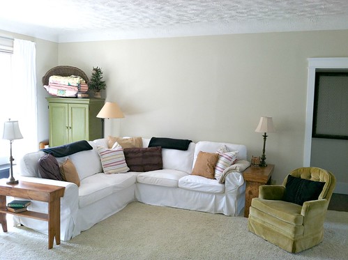
And by “finish”, I really just need to figure out what to do on the wall above our couch.
Plus we have plaster walls so I don’t want to put too many nail holes in (at least until I’m positive the nails will stay there for a while).
As you can see by the rest of the room, everything is very neutral (carpet, trim, walls, couch) and then I have accents of green, red, mustard, navy, brown, and black — so pretty much any color works in my house 🙂
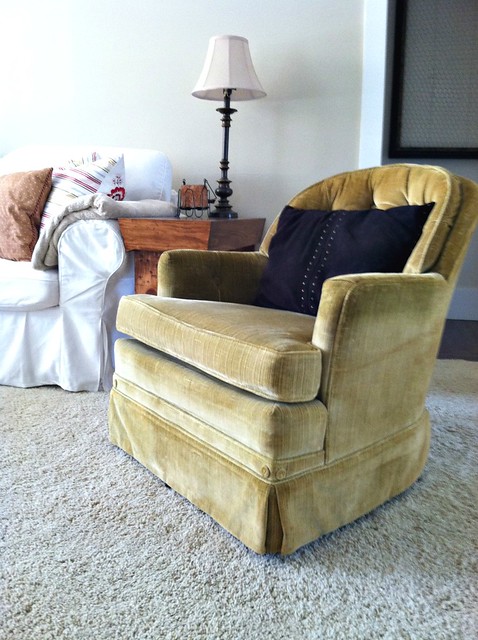
I should mention that the two mustard-colored swivel rocking chairs will eventually get slip-covered, we’re just “testing them out for size” right now before I spend the money.
But aren’t they cute? $35 for the pair on Craigslist!
Anyway, back to the living room…
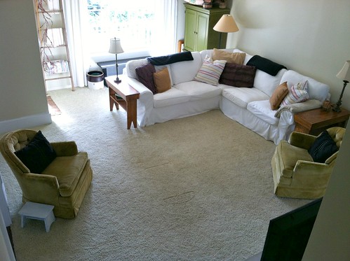
Here’s a bird’s-eye view of our living room — pretty much “to-scale”. You can click on the photo to enlarge.
UPDATE: After reading a few of the comments, I should mention that we are not interested in changing the layout of the living room. For the past two years we’ve been arranging, rearranging, and moving furniture — trying every option we can thing of — but we ALWAYS come back to the couch in this position. It makes our living room feel much larger, it gives Nora lots more room to move around, and it flows better with the rest of our house. Just trust me! Plus, Dave might shoot me if I ask him to move that couch one more time 🙂
All the other walls are decorated, it’s just the wall above the couch that need something… a big something 🙂
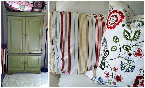
Here’s a closer look at the color pallet I really like…
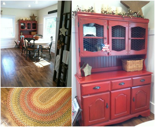
Also, now that we knocked down the walls between our living room, kitchen, and dining room, I’d like all the rooms to “flow” color wise. So here’s a picture of our dining room — hopefully I don’t spoil too much of our kitchen “reveal”!
So lots of “warm colors”.
I’ve already thought about doing a picture collage… but I feel like I would need SO many pictures.
I’ve thought about hanging old windows or an old door… but not sure how that would look either.
I’ve looked through Pinterest and I’ve flipped through magazines.
And now it’s been TWO years of living with a huge bare wall above our couch!
Thoughts, suggestions, ideas?
Anyone want to come do this for me? I’ll pay you in baked goods!



Verna says
Now that I am looking at your photos again, I’m wondering…could you put the green hutch across the corner instead of flat against the wall? I think that it might help the layout of your room….I guess you’d have to figure out if you can open the doors, though.
Danielle says
Hi! I would suggest doing a mirror and shelf combination…you can frame pictures and lean them on the shelf/mantel which would be created above the mirror. If you really wanted to square it up and add some symmetry add a candle sconce or long and narrow something on either side of the mirror below the shelf. Maybe relocate your green armoire and centre the sofa on that wall to make a cool looking focal wall! Good luck, you have lots of great options.
Verna says
I had the same problem. I finally found a large old window with lots of small panes in it, hung it horizontally and I hang a seasonal wreath on it. If you’re interested I would be happy to email you a picture.
Becky says
I think some family photos would be awesome
Either matted like the first comment, or one large collage frame that holds many.
I also like the idea of scripture of an inspiring quote
Cherylp says
I would look at Ballards Design’s web site or catalog, they always have great ways to decorate your wall. I just look at the catalog for ideas and then find what I am looking for at my favorite stores. I have ordered a couple of things from them and the quality has been good.
What about a big clock on the wall? Korklands is a good place for that, if you have one near you.
susie says
check hobby lobby! i have found cute things there!
Jo says
I vote for a Bible verse or other favorite short quote in beautiful cursive writing along the wall. Just a thought…
carol jane says
I think I would do a gallery wall with a mirror, some art ,and family photos. If you are afraid of making holes, use the command picture hangers. They work great. I have pictures on the wall foe 2 years now, and they are still hanging!
Ann says
Saribari.com is having their annual ebay auction right now but it will end soon. You could get a quilt in “your” colors and support a terrific (and Christian) organization which helps free women in India from sexual slavery. I just got my quilt (made from recycled saris) this week and I love it! It is not thick so would work perfectly for hanging!
Do you collect anything? I collect trumpeting angels so I have a large trumpeting angel quilt over our couch. It looks beautiful, is very “me”, and is a conversation piece.
I know of people in your area who can do the vinyl words in about any phrase or verse you want. I can get you the contact from a facebook sale site if you like. I love words so I tend to like the idea of “writing” something important to you and surrounding it with pictures (like one of the ideas above) but I also know of people who find words on walls distracting and not beautiful. The advantage to the words is that they can be vinyl and can be replaced without any holes!
If you plan to hang a rod, you can change what hangs there frequently (if you’re into that kind of thing. Personally, once I have it the way I like it, I never want to switch things up!) You could hang a quilt in the winter, hang frames in the summer, mirrors in the Spring, and fall/Christmas wreaths in the fall and for the holidays. The rod can stay, the other things can change.
Have fun! Make it simple and organized so that it is you! (And check out Saribari.com! Even if you don’t get into this fundraiser auction of quilts made by groups around the US and world, you can order sari quilts made by the women in India year round from their website!)
Patty@homemakersdaily.com says
How about a wall hanging? A small quilt or beautiful rug or tapestry. You would only have to have two or three holes to hang a rod and you could change it out easily if you wanted a different one.
If you didn’t want it to just “hang” loose at the bottom, you could attach it to a second rod at the bottom.
You could probably find something very economical, too.
Jolynn Van Wienen says
What about a ladder hung horizontally? you could dangle things at different heights from it and be able to change those items seasonally? you could wrap it with different types of garland? and possibly hang 3 different size pictures above it ( hang the pictures on the wall)? I’m pretty anal when it comes to symmetry so I’d probably hang them all in a row or the middle one slightly higher than the outside ones?
The other thing I’ve seen is hanging a curtain rod and then dangling things from it.
a blank wall is so hard to fill isn’t it?!?!?!?!
Karena says
On one wall we have a large star and a small to medium sized star on each side (total of three) and then a saying/quote aboe it all. Another room on the wall we have a large old window with a wreath hung with ribbon int the center if the window on another wall. Simple and works for me! Good luck.
Beth says
I tend to go for extreme simplicity. However, I am not known for my decorating skills. Still, I did see a large wall with a door hung horizontally. The door had been distressed. Another idea I saw n a decorator’s home was using large empty frames. She distress some and left some as she had found them. Looked great!
Evie says
Beautiful bright room! First, I would pull the couch out away from the wall six to eight inches and slide the whole thing maybe six inches to the right. I was looking around at fermlivingshop.com and found this Danish wallpaper: [IMG]http://i50.tinypic.com/donq7d.jpg[/IMG] I can see a tall, framed section of this wallpaper hung off center over the couch, placed vertically, and then along side it a row of large sepia or graytone family photos framed in similar frames and double matted in a mat of “pale mushroom” (or something not pure white) over a mat of red wallpaper. Link to wallpaper: http://www.fermlivingshop.com/collections/wallpaper/products/fairy-flower-wallpaper-red
I can’t wait to see what you decide!
Chris says
I would hang 4-5 pictures spaced behind the couch. Make the pictures possibly 8×10 and then mat. Make the frames wood, maybe paint them black because that is the rage or paint a color that makes you happy. Change the pictures as you go through life. If you get tired of family prints, put in pictures such as duncan prints. Duncan pictures of farm life are so like a farmhouse. Buy the calendar and use those pictures to make it affordable. You could also use cards and put the fronts in a frame with the matting making places for two prints. I have put the Duncan prints in frames with matting and they look like the real thing!
Evelyn @ Smallish says
I love the room; I love the colors! Great job. I have no advice for that wall though… but I like plain spaces so I’m not the right one to ask. Beautiful home!
Carl Ann says
Andrea,
Noting the country flair in previous photos you’ve shared, I would suggest a large antique window, painted a rustic shade of burgundy over mustard, adorned with architectural stars, and hung horizontally on the wall. You could then do sepia-toned photos of Nora and change out as she grows. You’d need only to affix the photos to the back-side of the glass panes. Love your blog. Cheers from PA.
Laurel says
I agree with Kelly (the first comment). Makes a lot of sense and creates a cozy room.
anne marie says
I would go for length with a horizontal display.
1) I think this simple candle pottery barn inspired chandelier (http://frugalhomeideas.blogspot.com/2010/01/pb-knock-off-candle-chandelier.html) could be modified to work on your wall- perhaps with flameless candles instead.
2) Place a twig-like mirror above (i.e. http://www.womansday.com/home/craft-ideas/decorating-craft-mirror-makeover-51141 or http://www.westelm.com/products/twig-mirror-w647/ )
3) Finally – flank the mirror with smaller eclectic collages of family pictures/ prints, etc.
That’s my 2 cents =)
Kate says
Here is an idea I love. You don’t have to use a wall decal- you could sub a big family photo! http://pinterest.com/pin/263812490643422631/
Andrea says
Love that Kate 🙂
Michelle says
I quite like this idea too!
We have a local company that can make sayings that say pretty much anything you want … and you have the beauty of a photo wall without need quite so many photos!
Awesome!
Leigh says
A quilt. Big, easy to hang, and you can get all your colours in.
I would move the couch about 8 inches towards the doorway so that the lampshades look more balanced space wise to frame it better. Plus it gives you a little more wiggle room around the “mud room” with out taking space from the living room part.
For a gallery wall idea, you do need tons of frames, but check out Young House Love for what they found to fill them.
Ramona says
I would get a couple of those old wooden windows and put pictures on the glass. The windows are big enough for the space and it’s also fun to re use stuff….
Tara says
I would definitely do a collage wall and use command strips to hang it. If you don’t want to find too many pictures, or don’t want it too ‘busy’ you could stick with a collage of larger prints. We have a collage wall of pictures behind our couch and my two girls (3 years and 20 months) absolutely love looking at all the pictures. We have wedding pictures, family pictures, and then just everyday ‘action’ shots framed. They love pointing out all the different pictures and talking about them.
Peitra says
My neighbors have an oversized, old LOCAL map above their sofa and it looks fabulous. It’s not too busy, but still striking.
Sara says
I don’t think you’d be happy with a collage wall in such a big and prominent place. It is hard for someone like you (and me) who craves simplicity and order to be bombarded with the busyness of many images in a room where you want to relax. Your brain will instinctively scan it, critique it, and quickly tire of it. I’d save the collage for a hallway.
Andrea says
Thanks for your advice Sara — you’re absolutely right. I had a collage in the hallway of our old house and loved it… but when I put a collage above the couch (also in our old house) I was always fussing with the frames, moving them, changing them, and getting sick of them. I think it was the “busyness” like you said!
Janice says
I share your love of primitive style decorating. I’m currently having the same dilemma deciding what to hang on the wall over our bed. My aunt, who also likes homespun primitives, has a wooden shelf in her living room with a rod attached underneath. She hangs homemade quilts from it and sometimes changes out the decor on the shelf with the season. It’s really cozy. I guess this appealed to me because I find generic art work impersonal. I want what is on my walls to reflect my interests, my family, my beliefs. That being said I have four big frames above my sofa in our living room, all in a row, with our kids pictures and the word family in “wall talk”. Clean, simple and neat. I’m sure whatever you choose will look great though!
Laura says
I think that two large black and white photos (family photos, or a favorite place) with a white matte, and a red or distressed red frame to bring in the red hutch from the dining room. I love your taste and color scheme!!!
Lea Stormhammer says
I love both the idea of the quilt and a local artist’s work. The large star mentioned too would give you a tie-in to your other rooms. You probably don’t need as much up there as you think – just something that isn’t too small. Leaving some white space will keep the open feel of the room.
We are very blessed to have a lot of family art – pieces painted by relatives – but also old quilts, architectural pieces, etc. You might wnat to dig through some family member’s extra items and see what you come up with too!
Happy hunting – what a fun project to be working on right now! And can’t wait for the final pictures of your kitchen/dining area!
Lea
Roberta Lott says
I agree with Kelly, I would flip the sofa to face that big wall and use the chairs to square off the area created by the sofa. That hutch would work where the TV is now. I think you would like it a lot better that way. Would create a cozier area and would not look so expansive. Good luck and have fun!
Victoria says
I think you are on to something with the old windows, seems like it would fit the room and the whole home, I see a lot of ideas for ‘old window art’ on Pinterest. Or a large mirror. also saw one where they took a bunch of dollar tree mirrors (must have been 8x10s but not sure) and made them in to one large, paneled mirror, looked really neat. In any case excited to see what you come up with, been on the search for an update for ours as well!
Tammy Skipper (@Tammy_Skipper) says
After looking at your color inspiration and adjoining dining room, I have to ask if you have a family quilt that would work. It would be textural, you could even rotate through different ones in different seasons. If you fold it and/or it’s a smaller piece, you could use it as a main ‘art’ piece then have smaller canvases/gallery prints of each of you along the side. (like a big fabric hanging with the three photos stacked on the side like a colon with a period underneath – that sounds strange, hope it makes sense to the wife of a teacher LOL). I could also see antique signs/ads in frames, ironwork/salvage pieces, and a combination of the above. With the slip covered furniture and soft textures, I think something very textural (iron, quilt, prints, canvas) would be great. And I would LOVE to come to your house and do it for ya 😉
Andrea says
Thanks Tammy — I’d love to have you stop by too 🙂
I thought about the quilt idea, and we do have one quilt from my husband great-aunt (I think) but it’s all pastel colors — and mostly pink. I don’t think it would look appropriate in our living room, but I am planning to use it in Nora’s room once she’s a little older.
Sandy says
Consider some floating shelves for the most versatility. You will be able to try most of the ideas posted here, without nail holes. The shelves can be used to place pictures and other objects on, even work add a space for mounting a large print, on the outside of the shelves. You may find that a bit more light (think battery operated led puck lights placed on shelves facing up). This arrangement would also allow for seasonal decorating and easy changes.
Lisa says
How about something textural…like hanging a quilt or painting or stenciling a jute rug?
Dea says
I love what Kelly described above.
We did something similar with our living room – I feel much more relaxed sitting together now. The backs of the sofas (we made a couch and loveseat feel like a sectional) help define the space and direct traffic flow, and that flow doesn’t come between people talking or watching TV. You could also consider putting that floor lamp (?) between the two chairs in front of the window. Functional plus looks cozy from outside.
JD says
I would move the sofas so they face each other, angle the cupboard type thing in the corner, so it fits diagonally. Your furniture is heavy so I would not do a few tiny wall treatments. Something of substance, a large rustic mirror? Large antique looking wall sign? Anyway, nothing danity or tiny. Bring in some brighter pillow covers and try to tie to mirror or sign? PS I would like banana bread.
Kelly says
I think a giant STAR would look perfect. My husband made one for me years ago using the wood from and old wooden pallet. I had seen one in an antique shop for a hefty price and knew it could be an inexpensive DIY project. He took apart the the pallet and screwed the wood strips (overlapping) to form a non symetrical star pattern. Because its not a perfect star shape gives it even more character. When I need a change I just paint it a new color 🙂
Katie says
Have you thought about doing one of those giant engineering prints from Staples? They’re B&W so it wouldn’t really bring in color, but it would fill a ton of space, give you a lot of bang for your buck, and Nora’s face would sure look cute up there 🙂 I’m excited to see what you end up doing!
Andrea says
Yes Katie — that’s actually one of the ideas I had!! We’re having family pictures today so we’ll see if one of them is “worthy” of blowing up for above our couch! Have you done anything like this before? I’ve seen tutorials on Pinterest but I’d love to see something in real life too…
Jen says
You could make the photo collage less intimidating by picking a “theme”. Maybe Your favorites of each of those “month old” pics of Nora, up through her first birthday?
Or you could keep an eye out for a painting (especially if it’s by a local artist!) that you and Dave really love and could stand to look at every day for years and splurge on it. I love the idea of investing in local artists. To me, it feels like a great place to sink a little bit more money than I’d usually spend.
Jen says
First off I would invest in command strips to hang anything on the wall, unless it’s super heavy. They are awesome! No holes! You can do a larger version of this frame art I did in my master bedroom, you can change out pictures easily. http://sewfabulous-now.blogspot.com/2012/07/inexpensive-wall-art.html
I would probably put up one large picture of canvas and put smaller pictures around it. You can always fill some frames with pretty scrap book paper that matches your pillows. And add a monogram to one and some free quote printables to some. So you really don’t have to have a bunch of actual photo’s. Good luck! Can’t wait to see what you choose! Love the chairs!
Kelly says
Honestly, I’d rethink the whole floorplan….I’d put the green hutch between the stairs and office door then I’d move what looks like a TV from that location and put it on the big wall behind where the couch is now. I’d flip the couch 180 degrees from it’s location now so it was facing the TV on that big blank wall and the backs of the couches are facing the office door and the kitchen/dining room doors. Then I’d put a nice skinny console table behind one or both couches with nice accessories. Finally, I’d put the two chairs as a pair framing the big window near the front door. They would make more sense together, not apart and could view the tv from this spot and be part of the cozy new couch arrangement. Many people hesitate to float the couch in the center of the room like this but I think it would make sense in this space. Try it on paper and see!
Jen says
I love your idea (please come to my house!), but I think they use the green hutch as a “mud room,” which is why it’s kind of near the door.